Contact

Facebook, the world’s largest social media platform, has recently undergone a significant user interface (UI) redesign, aimed at providing users with a fresh and intuitive experience. The motivation behind these changes is to enhance user engagement, improve accessibility, and streamline navigation within the app. The redesigned UI introduces new visual elements, modifies the layout, and simplifies the overall user experience. Let’s explore the key aspects of Facebook’s UI redesign and how it impacts users’ app experiences.
Motivation behind the Changes
- Enhanced User Engagement: Facebook’s UI redesign aims to boost user engagement by offering a more visually appealing and immersive experience. The updated UI focuses on presenting content in a cleaner and more organized manner, allowing users to easily discover and interact with posts, photos, videos, and other forms of content. By creating a visually engaging environment, Facebook aims to capture users’ attention and encourage them to spend more time on the platform.
- Improved Accessibility: Accessibility is a crucial aspect of the UI redesign. Facebook has taken steps to make the platform more inclusive and user-friendly for individuals with disabilities. The redesigned UI incorporates features such as increased color contrast, larger text sizes, and improved screen reader compatibility. These enhancements ensure that users with visual impairments or other accessibility needs can navigate and engage with the platform more effectively.
- Streamlined Navigation: The redesigned UI introduces a streamlined navigation system that simplifies the user experience and makes it easier to find and access different features and sections of the app. Facebook has reorganized the navigation bar, prioritizing frequently used options and providing quick access to key functionalities. The goal is to minimize user effort and enable seamless navigation, allowing users to spend less time searching for features and more time engaging with the content they care about.
New Visual Elements
- Updated Color Palette: The redesigned UI introduces an updated color palette that aims to create a more vibrant and visually pleasing experience. The new color scheme incorporates bolder and more saturated hues, enhancing the overall aesthetics of the app. The refreshed colors help differentiate various elements within the interface, making it easier for users to identify and interact with different sections and components.
- Modernized Icons: Facebook has modernized its icons, giving them a more sleek and contemporary look. The redesigned icons feature cleaner lines, simplified shapes, and improved visual clarity. These updated icons contribute to a more cohesive and visually appealing interface, creating a sense of familiarity while also providing a fresh visual experience for users.
- Visual Emphasis on Content: The redesigned UI places a stronger emphasis on the content itself. Facebook has reduced clutter and distractions, allowing posts, photos, and videos to take center stage. The updated UI employs larger images and more prominent media previews, making it easier for users to engage with and appreciate the content shared by their friends, pages, and groups.
Improved Navigation
- Simplified Navigation Bar: The navigation bar in the redesigned UI has been simplified to provide a more intuitive and user-friendly experience. The updated navigation bar offers easy access to the most frequently used features, such as the News Feed, Notifications, and Marketplace. It also introduces a customizable shortcut bar that allows users to personalize their navigation by adding their preferred shortcuts, such as Groups, Events, or Watch.
- Reorganized Menu Structure: The menu structure has been reorganized to enhance accessibility and streamline navigation. Facebook has categorized different sections and features into more clearly defined and easily accessible menus. This reorganization helps users find specific options more efficiently, reducing the need for extensive scrolling or searching.
- Contextual Navigation Options: The redesigned UI introduces contextual navigation options that adapt based on the content or feature being accessed. For example, when viewing a post, users can now access relevant actions and interactions directly from the top of the screen, eliminating the need to navigate to a separate menu. This contextual navigation saves time and provides a more seamless user experience.
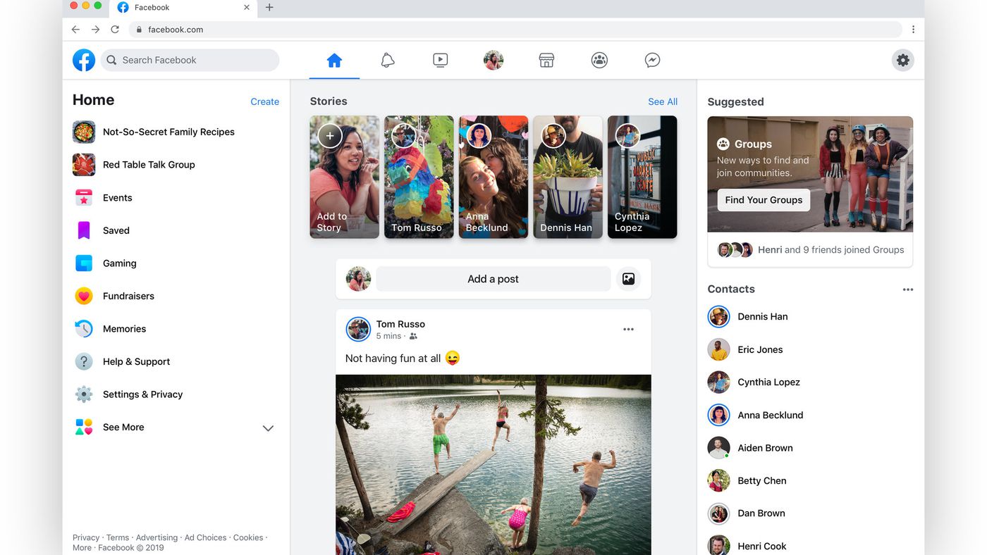
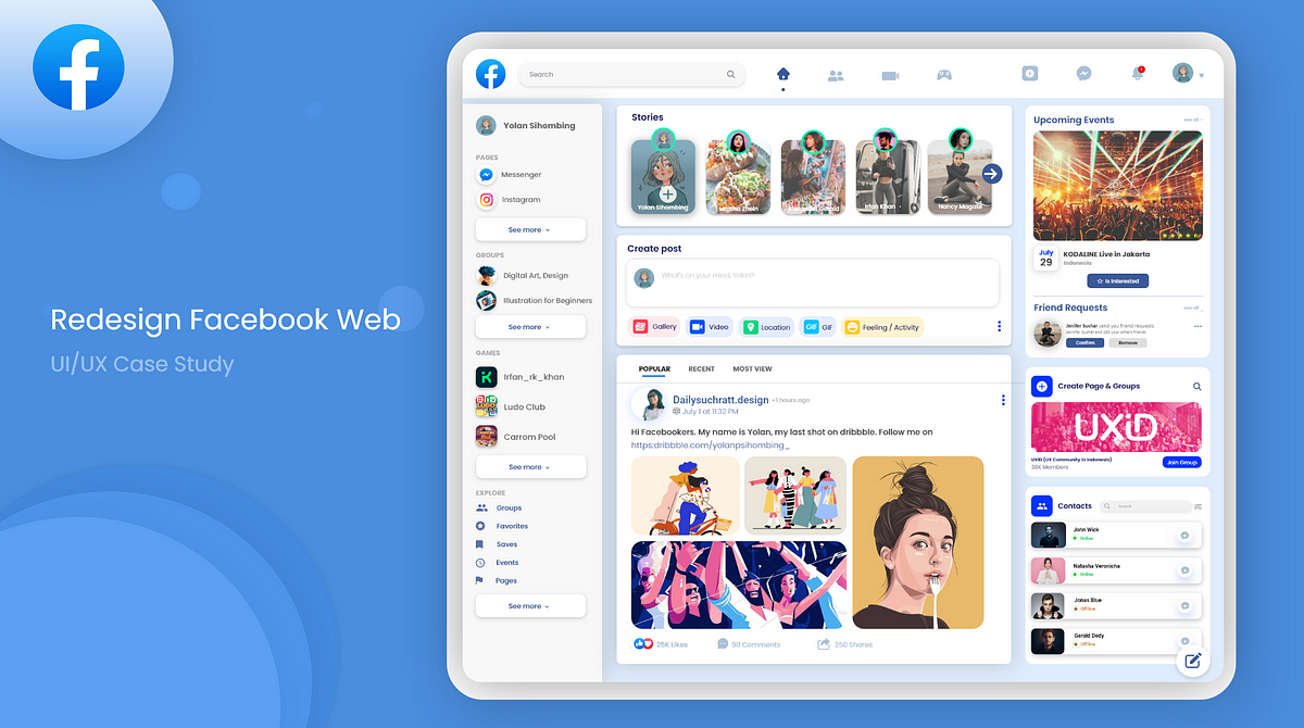
Before-and-After Screenshots
Before the UI redesign, Facebook’s interface featured a denser layout, with smaller icons and a more cluttered appearance. The navigation bar contained more options, and the color palette was relatively muted. The content took up less screen space, resulting in a less visually engaging experience.
However, with the redesigned UI, Facebook has transformed its interface into a more visually appealing and user-friendly environment. The layout is cleaner, with larger icons and more spacious content areas. The updated color palette adds vibrancy to the interface, and the streamlined navigation bar and reorganized menus enhance ease of use.
In conclusion, Facebook’s recent UI redesign aims to provide users with a fresh and intuitive experience. The motivation behind the changes is to enhance user engagement, improve accessibility, and streamline navigation within the app. With new visual elements, such as an updated color palette, modernized icons, and a focus on contentemphasized through larger images, the redesigned UI offers a visually appealing environment. The improved navigation, including a simplified navigation bar, reorganized menu structure, and contextual navigation options, ensures a more intuitive user experience. Overall, Facebook’s UI redesign strives to create a more engaging and user-friendly platform, empowering users to connect, discover, and share content with ease.